Designing a Typeface for the Visually Impaired

Applied Design’s Atkinson Hyperlegible typeface was developed as part of its rebranding of the Braille Institute of America – here’s how they did it.

Problem

According to the US’ Centres for Disease Control and Prevention (CDC) , approximately 4.2 million Americans have a visual impairment. Vision disabilities are expected to rise around the world in part because of population growth and ageing, according to WHO.

When New York-based design studio Applied Design rebranded the Braille Institute of America (BIA), its design team struggled to find a typeface that was both “extremely legible” and stylistically appropriate for the organisation’s new look.

In response to this, and aware of the growing number of visually impaired people around the world, the studio developed its own typeface for the project, Atkinson Hyperlegible.

Since adopting the typeface, the BIA has made Atkinson Hyperlegible free for everyone. Most recently, it has landed on Google Fonts.


Atkinson Hyperlegible Italic

ABCDEFGHIJKLMNOPQRSTUVWXYZ

abcdefghijklmnopqrstuwxyz

1234567890


Atkinson Hyperlegible Bold
ABCDEFGHIJKLMNOPQRSTUVWXYZ
abcdefghijklmnopqrstuwxyz
1234567890


Projects

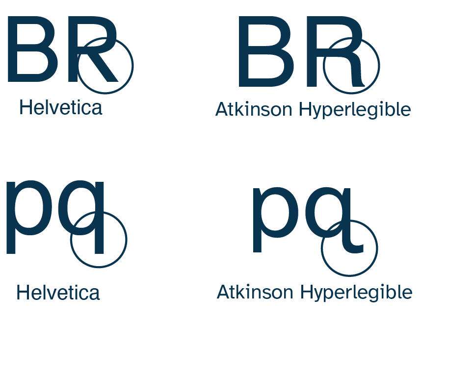
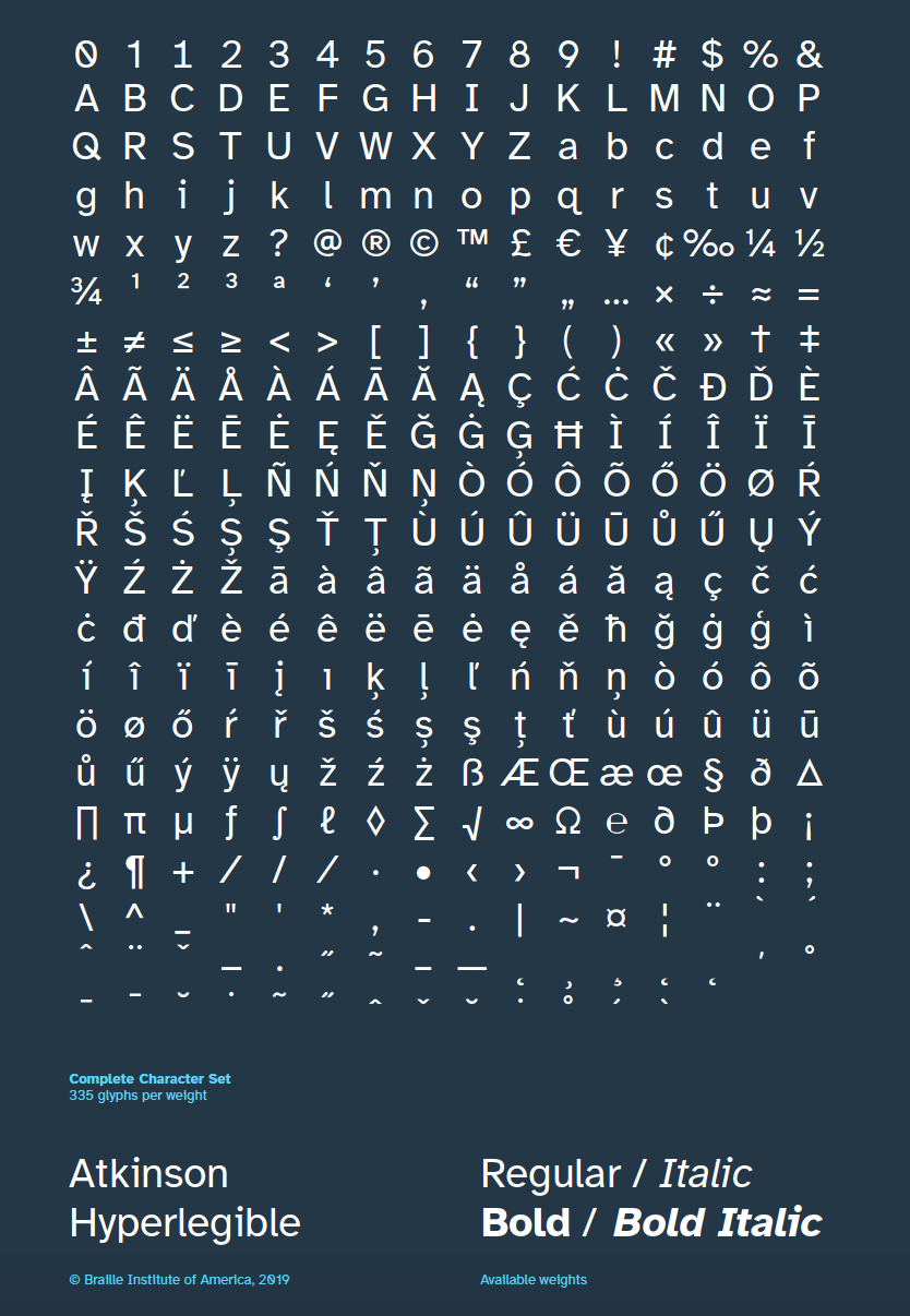
Named after the founder of the BIA, J. Robert Atkinson, Atkinson Hyperlegible is a modernist style sans-serif typeface. Applied Design creative director Elliott Scott says the team knew early on that this style of type would best fit the new BIA brand.

However it posed some challenges. “The problem is that modernist typefaces often sacrifice legibility because their characters are usually quite uniform,” Scott says. This is a problem when designing for people with visual impairments, because the goal is to ensure each letter is as distinct and unambiguous as possible to ensure comprehension and readability, he explains.

The process meant interrogating what it actually means for a typeface to be legible, Scott says. “We learn a fair amount in design school about legibility and readability, but not everything,” he continues.

Iterations

Applied Design’s first step was to create a limited character set prototype typeface, which incorporated “every legibility trick we knew of”, Scott says. This included combining elements from “many best-in-class legible typefaces”, he adds. One legible typeface the team looked at the humanist school of neo-grotesque san serifs like Frutiger. A couple of “stylistic flourishes” were thrown in for good measure too.

The fact the team were not experts in this field was something that needed to be considered throughout, Scott explains. “We knew enough to get started developing a legible typeface, and knew enough to know we didn’t know everything,” he says.

For this reason, the team was “open to feedback” during the development phase and during a public preview phase. “A lot of characters were tweaked, rethought, or even flipped, during the development,” Scott says.

Atkinson Hyperlegible Collateral

Testing

While the technical formation of the typeface was priority number one, Scott says it still needed to look nice. Aesthetics versus practicality in accessible type is a topic Design Week explored earlier this year.

On the subject, Scott says the team wanted Atkinson Hyperlegible to be a “typeface for everyone”. “We had seen some typefaces that exaggerate letterforms so much in the name of legibility, that people with full-sight have a hard time reading it,” he says. “We wanted to create something that if you didn’t know it was a legible typeface you wouldn’t really notice anything odd.”

Developing each element individually was an exercise in perseverance. “The sheer volume of characters was the hardest part of the project,” he says. Additionally, having each stage scrutinised, tested and critiqued – a necessary part of the process – was challenging.

That said, Scott says the project was “more of a chance to learn a whole lot really quickly”. “We got to challenge our own assumptions, break some typographic rules that we held sacred and all for the very best of reasons,” he says.

Atkinson Hyperlegible character sheet
Atkinson Hyperlegible Character Sheet
Atkinson Hyperlegible Collateral
Atkinson Hyperlegible Collateral-Tote Bag

Colophon

Designer Jessica Lin

Professor Marie Otsuka

Typeface Atkinson Hyperlegible Regular, Bold From Applied Design. Courier Bold From Howard Kettler.

URL https://www.designweek.co.uk/issues/2-8-august-2021/designing-atkinson-hyperlegible/